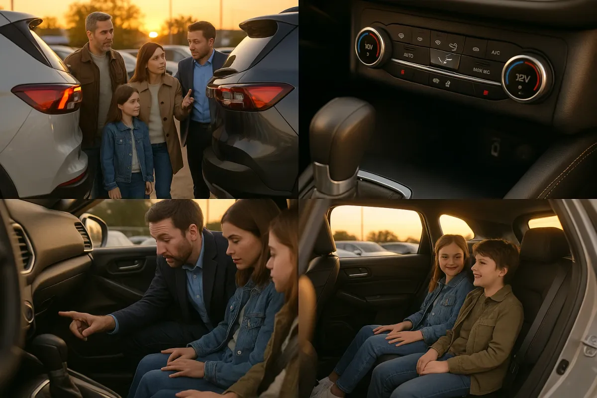
If you’ve been scrolling through SUV reviews lately, you’ve probably noticed something interesting: buyers aren’t just comparing horsepower and 0–60 times anymore. They’re zooming in on screenshots of infotainment menus, critiquing seat stitching, and roasting confusing button layouts on Reddit and Instagram. That shift lines up almost perfectly with a viral design article making the rounds today—“People Are Sharing Design Examples That Show How Important Proper Spacing Really Is”—where one misplaced space or awkward layout completely changes meaning.
The same principle applies directly to modern SUVs. As cabins turn into rolling tech lounges, small design and usability decisions can have outsized impacts on safety, comfort, and long-term satisfaction. In 2025, a serious SUV review can’t just stop at ride quality and fuel economy; it has to dissect UX, ergonomics, and interior logic with the same scrutiny graphic designers bring to type and spacing.
Below, we break down five design-focused review angles you should pay attention to when evaluating any new SUV—from a Hyundai Ioniq 5 or Kia EV9 to a Toyota Grand Highlander, Honda Pilot, or BMW X5. These are the details that rarely show up in spec sheets, but increasingly determine whether owners are raving… or rage-posting.
---
1. Infotainment Layout and Menu Logic: The New “Kerning” of SUV Design
If the Bored Panda design piece showed anything, it’s that spacing and structure are not cosmetic—they’re functional. In SUVs, the infotainment system is where this matters most. Automakers like Mercedes-Benz (MBUX), BMW (iDrive 9), Hyundai/Kia (ccNC software), and Tesla (single-screen minimalist interface) are all racing to build interfaces that look futuristic but also work under real driving conditions.
When you’re reading or watching reviews, pay attention to how testers describe menu depth and discoverability. Is climate control on a permanent physical bar (as in many Toyota and Honda models) or buried two layers deep in a touchscreen submenu? Are primary driving controls—drive modes, traction control, camera views—accessible with a dedicated button or relegated to a small on-screen icon? Many 2024–2025 reviews of vehicles like the Volkswagen ID.4 and some Stellantis models have criticized functions that feel “app-like” rather than “car-like,” requiring too many taps for simple tasks. Good implementations, such as Hyundai’s latest UX in the Ioniq 5 and Kona, keep core functions on the first screen and maintain large, high-contrast touch targets that you can hit without looking for more than a second.
In 2025, serious reviewers are starting to grade these systems the way UI professionals critique app design: they’ll talk about latency (screen response time in milliseconds), font size, contrast ratios in bright sun, how the system handles partial voice commands, and whether wireless Apple CarPlay/Android Auto reconnect smoothly on short trips. Treat those details as non-optional evaluation criteria. In practice, a clunky infotainment system will annoy you dozens of times per day—far more often than you’ll ever exploit the last 20 hp of engine output.
---
2. Physical vs. Touch Controls: Why “Button Bloat” Beats Hidden Functions
The design-portfolio disasters highlighted in that spacing article often come down to one thing: the designer tried to do too much with too little real estate. Several automakers are making the same mistake, aggressively stripping physical buttons and consolidating controls into smooth, buttonless surfaces or touch sliders in the name of minimalism.
Recent examples have drawn pointed criticism. Volkswagen is walking back its touch-sensitive steering wheel controls after owners and reviewers complained about accidental inputs. Capacitive sliders for volume and temperature—common in earlier ID.4 and Golf variants—were often panned in reviews for poor nighttime visibility and imprecise operation. Tesla still routes almost everything through the central screen, and while many owners adapt, reviewers routinely note the learning curve when even glovebox access or mirror adjustment lives behind multiple taps.
By contrast, 2024–2025 SUVs like the Lexus GX, Toyota Land Cruiser, and Honda Pilot are winning praise for retaining a robust set of tactile knobs and buttons for high-frequency controls: temperature, fan speed, defrost, drive modes, and key off-road systems. In depth reviews often call this out as a “daily usability win,” even if the cabin looks a little busier in photos.
When you read or watch an SUV review, look for:
- Does the critic mention “eyes-off-road time” when operating climate and audio?
- Are steering-wheel controls distinct in shape and feel, or flat capacitive pads?
- Can you change volume, temperature, and defog with gloves on?
- Are critical safety features (lane-keep, parking sensors, auto stop-start) one-press toggles, or nested in the screen?
Professional reviewers are increasingly ranking physical control schemes as a safety and ergonomics metric, not just a styling choice. Treat any SUV whose review notes “too many essential features locked in the screen” as a red flag for real-world driving.
---
3. Interior Spacing, Seat Geometry, and Visibility: When Millimeters Matter
The viral design examples showing how a single missing space changes meaning have a direct parallel in interior packaging: a few millimeters here or there can decide whether a cabin feels airy or cramped, ergonomic or fatiguing. That’s why top-tier SUV reviews now measure and discuss:
- **Hip point height**: How easy is it to slide in and out? Crossovers like the Subaru Forester and Toyota RAV4 consistently review well because you “sit into” them instead of climbing up or dropping down.
- **Knee room and toe room**: Numbers on paper don’t always tell the story. Reviewers often mention whether second-row passengers can slide feet under the front seats and if knees contact hard plastic seatbacks.
- **Third-row livability**: In 2024–2025 reviews, models like the Toyota Grand Highlander and Kia Telluride are praised for adult-capable third rows, while some competitors are called out as “kids-only for short trips.” Pay attention to reviewers’ height and seating position when they test this.
- **Sightlines and blind spots**: As beltlines rise and D-pillars thicken for crash safety and styling, outward visibility can suffer. Many reviews now explicitly critique rear-quarter visibility, camera resolution, and whether the hood bulge obstructs close-up view in parking lots.
A telling sign in professional reviews is how often the word “fatigue” is used. Reviewers spending full days in SUVs notice subtleties you might miss on a short test drive: seat base length for thigh support, lumbar adjustability in multiple directions, and headrest angles that don’t force your head forward. In premium models like the Volvo XC90 or BMW X5, multi-way adjustable seats with extendable cushions often get highlighted as a serious comfort advantage.
When evaluating reviews, look for clear, specific commentary rather than vague “it’s comfortable” language. Phrases like “supportive over four hours,” “no hot spots between shoulders,” or “no pressure behind the knees for taller drivers” are far more meaningful than general praise.
---
4. Interface Consistency and Labeling: The Hidden UX Test Most SUVs Fail
That Bored Panda article underlined how bad spacing can totally change the message of a sign or product. In SUVs, inconsistent terminology, iconography, and labeling across screens and buttons can create similar confusion—and professional reviewers are starting to call this out.
A well-designed SUV interior maintains semantic consistency:
- Traction control is always called the same thing on the button, in the menu, and in the owner’s manual.
- Drive modes (“Eco,” “Normal,” “Sport,” “Snow,” “Off-Road”) use intuitive names and icons that match the vehicle’s intended use.
- Safety system alerts use clear language and distinguish between “advisory” and “intervention” states.
You’ll often see reviewers criticizing vehicles where lane-centering is called one thing on the cluster, another on the central screen, and described yet another way in the manual. Some 2023–2024 models from multiple brands were noted for confusing names like “Steering Assist,” “Lane Tracing,” and “Lane Keep” used interchangeably, leaving drivers unclear about what the system is actually doing.
On the positive side, brands like Hyundai/Kia and Subaru have recently been praised for more coherent ADAS (advanced driver-assistance systems) labeling and clear on-screen animations showing when the vehicle is actively centering or just monitoring. Reviewers frequently show these graphics on video, and that’s your chance to judge how readable and intuitive they are.
Before you buy, comb through several reviews and pay attention to:
- Do reviewers mention needing the manual to understand drive modes?
- Are warning chimes and messages merely “annoying,” or are they described as “unclear” or “cryptic”?
- Do icons change shape or color logically as features activate/deactivate?
As in graphic design, clarity beats cleverness. An SUV whose interface looks slick in photos but confuses professional reviewers is likely to frustrate you in the real world.
---
5. Practical Design: Cargo, Small-Item Storage, and Real-Life Usability
The “bad design” examples trending online aren’t just ugly—they actively undermine usability. The same is true of SUVs with beautiful cabins that ignore everyday practicality. Strong modern reviews don’t stop at cubic-foot numbers; they stress-test interiors with strollers, luggage, groceries, camera gear, and pets.
When you examine reviews, you want to see detail on:
- **Cargo floor height and shape**: EV SUVs like the Kia EV9 and Hyundai Ioniq 5 often have flat floors and squared-off openings that reviewers love for easy loading. Some PHEVs and hybrids, by contrast, have raised, uneven floors due to battery packaging—this often earns criticism even if the official volume is competitive.
- **Seat-folding mechanisms**: Reviewers will note whether seats fold flat with a single lever, if headrests require removal, and whether there are power-fold options in the cargo area. Anything that requires multiple trips around the vehicle tends to draw negative comments.
- **Small-item storage**: 2025 crossovers are increasingly evaluated on center-console design: is there a phone slot that actually fits modern large phones with cases? Are cupholders adjustable for different bottle diameters? Does the wireless charger actually hold the phone in place during corners, or do reviewers mention overheating and connection dropouts?
- **Family-friendly touches**: Reviewers with kids will highlight rear door opening angles, availability and placement of rear USB-C ports, integrated sunshades, and whether LATCH anchors are easy to access without digging into the seat bolsters.
You’ll also see more reviews benchmarking material durability rather than just softness. For example, rugged SUVs like the new Lexus GX and Land Cruiser earn points for rubberized, grabbable surfaces and easy-clean materials, while some luxury crossovers get dinged for glossy piano black panels that show every fingerprint and scratch. That’s the automotive equivalent of a beautiful but illegible typeface: looks good in photos, ages terribly in real use.
When an experienced reviewer describes an SUV interior as “thoughtful,” “family-friendly,” or “clearly tested by people who live with kids and gear,” that usually reflects dozens of smart micro-decisions in packaging and layout—exactly the kind of design fidelity that separates a good SUV from a frustrating one over five to ten years of ownership.
---
Conclusion
The viral conversation around bad spacing and layout in design circles this week is more than a meme; it’s a lens you can use to read SUV reviews more intelligently. In 2025, the difference between a vehicle you tolerate and one you genuinely love often comes down to design nuance: interface structure, control logic, seating geometry, clarity of labeling, and small but crucial usability touches.
Engine power, range, and brand image still matter—but they’re no longer the whole story. As you research your next SUV, prioritize reviews that dive into these design and UX details with the same rigor a professional designer brings to typography and layout. The SUVs that score highest on this front—whether they’re mainstream models like the Hyundai Tucson and Subaru Forester or premium offerings like the BMW X5 and Lexus GX—tend to be the ones owners praise long after the new-car smell has faded.
In other words: in the age of tech-first cabins, good design isn’t just nice to have. It’s a core performance feature.
Key Takeaway
The most important thing to remember from this article is that this information can change how you think about Reviews.


